
Many business owners only focus on content, pricing, or ads but ignores one of the important part of a website which is color.
Your product is good, website is also good but still visitors are not getting converted, the reason behind this is often your design does not feel right.
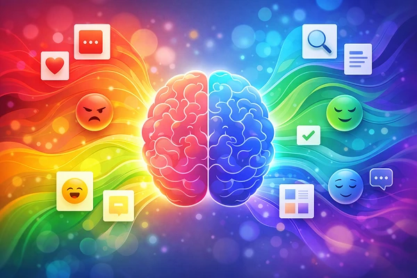
Colors influence how user think, feel and act. Wrong choice of color can confuse visitors. But the right one can guide them towards taking action.
This is why color psychology in UI design is so important. It’s not just about making your website look attractive but about making users trust you, stay longer, and convert.
What is color psychology in UI design?
Color psychology in UI design is about the study of how colors influence user emotions and decisions when interacting with a website or app.
Different color has different emotions :
- Blue builds trust
- Red creates urgency
- Green signals growth or safety
- Yellow grabs attention
When used correctly, colors can :
- Improve user experience
- Increase engagement
- Improve conversions
As color has power to influence user behaviour, so it is very important for any business website to choose the right one.
Why color matter for user behaviour?
1. Emotional impact of color in design.
Users don’t read anything, they just scan your website first.
In few seconds, they decide :
- Is it trustworthy?
- Is this professional?
- Should I stay or leave?
For example :
A finance website using dark, inconsistent colors may feel risky.
A Health Care website with harsh red tones may feel uncomfortable.
The emotional impact of colors in design directly influences user trust and engagement.
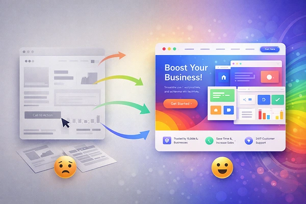
2. How color affects user decisions?
Color influences user action.
For example :
A bright CTA button stands out : More clicks
Soft background color reduces eye strain : Longer sessions
This is how color impacts user decisions at every step of the user journey.
3. Color impact on User experience (UX)
Good color choices helps to improve usability. Wrong choices create confusion.
Key UX benefits of proper color choice :
- Better readability
- Clear navigation
- Quick decision making
- Reduce bounce rate
Use of right color scheme for your website ensures users don’t feel lost or overwhelmed.
UI color psychology examples
1. Ecommerce Website
Red or Orange CTA buttons : Urgency : More purchase
Clear white background : Focus on products
2. SaaS website
Blue tones : Trust and readability
Minimal color palette : Professional feel
3. Restaurant website
Warm colors like red and yellow : Stimulate appetite
Dark backgrounds : Premium feel
This is how colors align with your business goals.
Best colors for website conversion
There is no single color for conversion, it depends on your target audience and industry.
However some patterns work well :
Red : Urgency, action (great for sales button)
Blue : Trust, security (Ideal for corporate sites)
Green : Growth, success (used in finance, eco brands)
Orange : Enthusiasm, attention (good for CTA)
The important thing is contrast and clarity, not just color choice.
How to choose colors for UI design
Choosing colors is not a random action, its strategic.
Step by step approach :
1. Understand your audience
- Who are they?
- What emotions should they feel?
2. Define your brand personality
- Professional : blue, grey
- Energetic : orange, red
- Luxury : black, gold
3. Use color theory in web design
Follow basic principles:
- Complementary colors for contrast
- Analogous colors for harmony
- Limit palette to 2 to 4 main colors
4. Focus on CTA visibility
Your buttons must stand out clearly.
5. Test and optimize
- Run A/B testing to see which colos perform better.
- This is how you build a strong UX design color strategy.
UI design color best practices
The following practical tips you can apply immediately :
- Use contract for readability.
- Keep background colors neutral.
- Highlight important elements with bold colors.
- Maintain consistency across pages.
- Use colors to guide user flow.
These practices improve both usability and conversions.
Common mistakes to avoid
Even good websites fail because of poor color decisions.
1. Using too many colors
This creates confusion and reduces professionalism.
2. Poor contract
Makes text hard to read and irritates users.
3. Ignoring brand identity
Inconsistent colors weaken trust.
4. Copying competitors blindly
What works for others may not work for your audience.
5. No testing
Assuming instead of actually checking the performance.
Avoiding these mistakes improves the importance of colors in UI UX design.
Benefits of using right color strategy
When done correctly, colors can :
Increase conversions
Clear CTAs : More clicks : More sales
Improve User experience
Users feel comfortable and go through all sections.
Strengthen brand identity
Consistent colors build brand reputation
Boost SEO indirectly
Better engagement : Lower bounce rate : Improved rankings
Conclusion :
Understanding color psychology in UI design is not optional anymore, it is a very important part. Colors influence emotions, guide decisions, and directly impact conversions. When used strategically, they can turn a dull looking website into a powerful sales tool.
If your website is not converting, don’t just change content, start with colors. You might be surprised how much difference it makes.
Frequently Asked Questions
1. What is color psychology in UI design?
It is the study of how colors influence user emotions and behaviour on websites or apps, helping improve engagement and conversions.
2. Which color is best for conversion?
There is no specific color which is best for every kind of website. It depends on the type of website and target audience.
3. How do colors affect user behaviour?
Colors influence emotions, attention, and decision making, guiding users toward actions like clicking or purchasing.
4. How many colors should a website use?
Ideally, 2 to 4 main colors to maintain consistency and avoid confusion.
5. Can changing color really improve conversions?
Yes. Even small changes like CTA button color can significantly increase clicks and sales when tested properly.